arthead sf

arthead sf blog was created to bring readers the meaning behind the art. These are not critiques or interviews with artists. Each feature is written entirely by the artist, revealing only what they feel and want readers to know about the featured piece. If you see a piece of art you'd like to know the meaning behind...email me. And subscribe to my blog below to get updates when new features are posted!


Web www.artheadsf.blogspot.com

Friday, October 27, 2006

Nov. 4th Gray Area Gallery Opening!

Make sure you check out Jenn Porreca's The Red House Harlot, featured below, at the Nov. 4th opening of Gray Area Gallery! There are lots of other excellent artists showing at this opening. check out the flier!


Jenn Porreca- The Red House Harlot


"The Red House Harlot"
On found wood from refugee houses in San Francisco, 1906
11x54 inches
For exhibit at the upcoming Gray Area Gallery opening, November 4th, 2006

"The energy of found wood is something that has a huge piece in my art, whether new wood or old, each object painted on has always carried a particular energy. With this piece, I found it interesting how the wood’s grooves, crevices, and old nail holes, guided the spirit of the painting. The wood itself is from refugee housing from after the earthquake in 1906. I found several pieces with a friend out at the San Francisco Zoo to paint on. This piece is layered with a base coat of varnish to seal in any cracks, an overlay of acrylic and multiple layers of gouache. The Red House Harlot piece is a visual fable about a woman who takes to desperate measures in extremely trying times to feed herself and her child. It’s about the struggle of all of mankind after major natural destruction and devastation, and the beauty that still lies within to persevere. It’s got a ton of history in the wood, and it was truly awesome to create a piece of art out of it."


By Jenn Porreca
http://www.jennporreca.com/

Saturday, October 21, 2006

Minchi


Minchi is an artist living and working in Hyogo, Japan.

"Empire of ice"
7.873 x 7.873 inch
Corel Painter

"This painting was inspired by figure skating i saw on the television.

It portrays a feeling of freeness.

The color of the thing is made from a lot of elements. I pull out all the colors that I saw.

It took one week to make."

When asked to reveal one thing most people do not know about her, Minchi's response was:
"I imagine the world, cut out the moment of the world and make it a picture.People say that my picture is grotesque and cruel at time.I like happy ending. However, there must be various difficulties by the time it reaches the happy ending. And, The reality might not severely become a happy ending. I make inward struggle and difficulty a picture. It is a thing that everyone experiences, and will strike the heart of people.The actual world is cruel at times though I do not want the cruel world. I only faithfully draw it. Grotesque and cruel is not the essences of my picture.

By Minchi
http://minchi.lomo.jp/

Friday, October 20, 2006

"News: Arthead sf picked up by Fecal Face!"

You can now also read arthead sf on fecalface.com under the blog section! Moving forward, new features will be posted weekly, here and on fecalface.com.

Wednesday, October 18, 2006

Hunter Mack


"Fortunately Positioned"
18 inches by 24 inches
Charcoal and Gouache

"This is a fairly typical piece of mine, but one of my personal favorites. Typically, I like pieces that look totally worked; I'm talking about sweat and guts remade into a painting or drawing. So, I like Jim Dine, obviously. Another glaring influence is Schiele, so I'll lay that down pretty quick.

Most of the time I have a shape in my mind when I begin a drawing. It's usually a pretty androgynous shape, but I know the positioning and the intersections. For this one I drew it out on watercolor paper using different charcoals, avoiding any erasure marks since that doesn't work too well on this paper. When the right shape takes place, I then laid down 10 or 12 extremely watered down gouache colors until it felt right. (Then a layer of fixative so it doesn't get all messed up).

The two main elements that I focus on are color and shape. It's how these two play out in the viewer's head that interest me the most. So, there's never a particular subject or person, just a feeling that I try and get across to whoever looks at the piece. Picking out elbows or armpits isn't really a concern.

In the end, using charcoal and gouache allows every mark to come out in the finished drawing so it's kind of a fully comprehensive document outlining the progression of it from start to finish, and that's an important story in and of itself."

By Hunter Mack
http://www.artamiss.org/artist_detail.php?artist_id=82

Monday, October 16, 2006

Joseph Reihsen


Creatures of the Deep Deep, 13
Acrylic on panel
25" x 22"


"In these works I seek to portray a vacuous cybernetic dystopia populated by biomorphic figures recollecting, encountering, attacking, and sometimes just feeling each other out. These creatures represent an anthropomorphized amalgam of plant and animal elements, sometimes at odds with themselves, cavalcading at once elegantly and at the same time in a parade of reflexive destruction.Borrowing a language science fiction, I seek to explore the issues of a dystopic universe as it relates to contemporary concerns of the often corrosive yet beautiful relation between human animals and the botanic and geologic natural world we occupy."

By Joseph Reihsen
http://www.joespaintings.com/

Friday, October 13, 2006

"News"

Matt Furie, Casey Jex Smith and Martha Sue Harris will be at 111 Minna this Tuesday, Oct. 17 from 6-9pm for Sketch Tuesdays (which is live sketching/art making).
And I'll be there too.
And so should you.

Martha Sue Harris


"Bad Fungus" from my installation "Botanica Beluosa"
"Bad Fungus" 3 x 3 x 1 in
"Botanica Beluosa" 4.5 x 2 x 8 ft
Fleece, thread, fabric paint


"I find a lot of inspiration from botany and the environment, which are both interests of mine. I was interested in plant communities, for instance the symbiotic relationships that develop between fungi and trees. My installation was based loosely on an oak tree plant community. I take these general ideas as starting points and add some inspiration from human relationships and emotion, so that the work feels less like a science paper and more like something I can relate to. I try to touch on all these ideas and I see "Botanica Beluosa" as outlining a family of characters which have all these complicated relationships and backstories. I see it as a starting point for the dramas that occur in plant communities. Botanica Beluosa was a fairly full time project for about 3 months.

Bad Fungus, a character in the installation, was inspired by slime mold, I’d been reading about it and Bad Fungus is the result. It was also somewhat frosting inspired as I have a big thing for cupcakes with cherries on top.

Interesting facts about slime mold:
• It’s a Protist which is not a plant, animal or fungi, it has a few things in common with each.
Hieronymus Bosch depicted an estimated 22 species in The Garden of Earthly Delights

Creating fabric-based installations is a relatively new direction for me, it evolved out of the one of a kind sculptures I make called 'Monster Dolls.' The "Monster Dolls" are kind of playful, kind of dark version of children's plush dolls. I decided to challenge myself to take them further. So the stuff I'm interested in making now is a little less of a single, character driven object. I try to use more unusual and varied techniques incorporating crochet and unusual hand-stitching. I take subject matter from some of my interests in botany and the environment, and the finished products all become part of an interrelated environment in an installation space. You can still buy pieces of the installations, and I still sell individual monster dolls online, but the installation work is about doing something bigger than life and more unexpected."

By Martha Sue Harris
http://www.marthasue.net/

Thursday, October 12, 2006

Reuben Rude

"Don't Try"
18" x 22"
Collage and Acrylic on board


"In the city, there are these great walls, covered with tattered posters and graffiti, with spattered paint and stickers. And some kid has scrawled swear words in ball point pen while waiting for the bus. Sometimes these unintentional collaborations, these time-lapse collages, are just perfect.

I like paintings that make me feel like they are definitely about something, that they have meaning, but I can't quite figure out what it is. I like the idea that there is something going on that I don't understand, that fills me with childlike awe. In the spirit of not spoiling that feeling, I won't say what this painting is about...plus I don't really know what it's about myself. But that guy looks kind of lonely, doesn't he?

First I took a photo of Mission Street in San Francisco, and messed with it in Photoshop, making it into a silhouette. Then I printed it, and took it to a copy shop, where I copied it a few times, as well as enlarging it, so I had a fourth or fifth generation copy, in about four different pieces. Then I sprayed the copies with Krylon Crystal Clear, to make them more durable. I then cut and tore them into smaller pieces for easy pasting to a piece of birch plywood, using acrylic matte medium. After distressing the surface using sanding and spattering, I pasted some pages of a couple of different books onto the board(one book is an incomprehensible text about art, the other an out-of-date engineering manual), creating the sky. All along the way, I continued to lay washes of acrylic paint, as well as spatter, tear and sand the surface. I also painted completely over all the silhouetted background, changing it in some places, and blending it texturally with the sky/pages. I drew the figure smaller than painting size on a separate sheet of paper, loose and sketchy. I scanned the drawing into my computer, and also took a digital picture of the background I had so far. Using Photoshop, I laid the figure onto the background, and got it to the size I wanted. Then I printed out just the figure in two pieces, sprayed it with Crystal Clear, and glued it to the background. After laying a fairly heavy white wash on the figure with gesso(so i could just make out the lines), I repainted the figure, using acrylic, both paint and various mediums. I continued to work on the figure and background until they were looked done, but I still felt there was something missing. I decided it needed some butterflies, so I painted them in there. After putting down a coat of satin finish with UV protection, I called it done...phew!"

By Reuben Rude
http://www.reubenrude.com/

Tuesday, October 10, 2006

Brian Barneclo

"New World Diesel" (2005)
7ft by 2ft
Acrylic on canvas

"People who look for meaning in art will have an easy time with this painting. Usually I like to put enough stuff in a painting so that people can come up with a meaning but rarely is there one specific meaning I'm trying to capture. It's like if there's a traffic accident on the street and 20 people witness it, you'll have 20 different stories of what happened. So it's the concept of multiple truths. Each person living their own truth in the world.

So this painting is pretty obviously trying to say something about the power struggle over oil and religious idealism in the world. Clash of cultures. Fighting in the streets. The little bit of Arabic in the middle was my favorite part about this painting because as I was painting this the Iraqi's were holding their first elections and also the NBA all-star balloting was taking place. And on the NBA website you could vote for your favorite player to play in the all-star game. There was a little button that said "vote here" in all different languages including arabic. So, apparently that's what it says.

I like playing with multiple meanings. So staying with the mosque-like building in the center, I tried to play on the doorways acting as archways but then also resembling the infamous arches we've all come to recognize. The word "free" appears next to the arabic for "vote here" playing on double meanings of freedom and an eye catching advertisement.

So these are the little ways that I try to put meaning into my paintings. It's pretty happenstance,- just like life is. Next time you visit an art museum and walk out the doors keep looking at things as if it's still art. For me, it's less about what it means and more about how it feels. It's not just rational response but a intellectual/emotional response.

I spent about a week on it."

By Brian Barneclo
http://www.brianbarneclo.com/

Sunday, October 08, 2006

Jenn Porreca


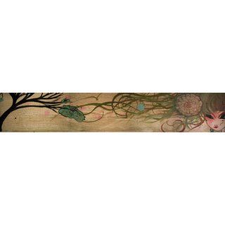
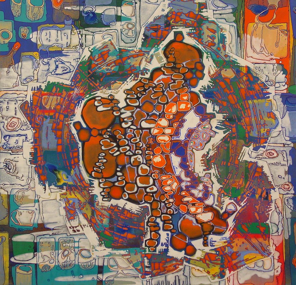
"The Aftermath"...a live painting piece from August 2006, 111 Minna
14inches tall x 48 inches wide
Mixed media on found wood board from San Francisco

"The Aftermath is an exploration in live art completed in August at 111 Minna Gallery in a matter of just 4 hours. This piece was particularly interesting for me to conceive of and execute on as i found myself interacting with the crowd during my live painting. During live painting sets these days, i attempt to interact with the crowd, get them angry, sad, emotional, whatever, and then make peace with them as i finish my work, all in a non-verbal visual interaction. I will paint imagery, erase it, over and over again, like sandstone mandelas, letting each image go until i am finished or satisfied. Oftentimes, however, people get attached to the imagery i create, and when erased have quite a virile reaction. Once i even had a woman yell at me for erasing a painting. Over 4 different paintings were done and erased on this wood board throughout the evening for this particular piece, and this final image was the result.

The Aftermath piece is an exploration in themes of the wars I as an artist have with myself while using my creative medium to interact with the physical world, yet turned out into a dreamlike reality. My women are scarred, human, yet, impenetrable and inhuman at the same time. I suppose in a sense my work is a reflection of art as an extention of myself. Through it i feel fearless, yet while creating it i battle myself to continue.

Aesthetically, I also find myself exploring the familial history of those closest to me, and the imagery of cartoons from the 20s, manga, and superhero status that few females seem to achieve in the comic book world, but combining that exploration with themes of history through old found wood boards from historical houses in San Francisco. My live painting performance in August at 111 Minna was a special evening for me, as i have long waited to show my work at that Gallery, and i had a crowd of people who seemed to be so moved my painting and erasing of imagery on wood, that they actually got upset with me when i would wipe over what they thought was a finished work. I felt myself battling with myself creatively to not shrivel up while painting live and also with people getting angry and walking away when i would wipe down the board, but then letting go of the outcome that they would come back and see the final piece, "The Aftermath" of free flow creation.

I thoroughly enjoyed the creation of this piece, live painting is much more of a free process than at home, and as it turns out the crowd came back around for the final image shown here. My pieces painted at home are more conceptual, whereas my live art...well, sometimes you just have to let go of the outcome."

By Jenn Porreca
http://www.jennporreca.com/

Thursday, October 05, 2006

Sarah Walker

"Aggregate I" (2006)
23" x 24"
Acrylic on paper


"As I am maniacal with a small brush, and this is what keeps me out of trouble most of the time, I find my obsessive painting strategies soothing. There are moments, however, when a pinprick of anxiety registers and I shift around looking for a place to park it.
Just such a pinprick came about when I realized I was wasting a lot of paint- acrylic paint- a non-recyclable plastic product. Additionally, there was the wasted time mixing and color-matching all those colors in little plastic cups (that ineffectually wear little plastic cup hats to prevent the paint from drying out).

I had to get on it, I was going away for a week; so I did this thing with the paint, something I have referred to as ‘patches’, such as what I make when mixing and testing colors on scraps of paper. They are always "the best thing in the studio" according to some visitors. Even though I hate those studio guests I am willing to take seriously that the paint test strips with their overlapping chunks of color do emit a certain eau d’modernism that people now more than ever just love to love.

So on an oversize piece of paper cut from the roll a veritable toxic geography of sloppy patches of paint spread out and piled up like old linoleum, which I cut up like yardage into squares to be used as grounds for ‘real paintings’.

Anxiety now dispatched, I settle into my favorite painting routines: outlining all edges with sharpie marker then painting them all out with white, watching only the line work bleed through (this I call ‘capture’). I also enjoy making pools of paint within the volumes delineated by the bleeding sharpie lines, letting these dry then pooling more paint within smaller sections ad infinitum until an information saturation of immense iridescence emerges, which I’ve termed ‘oil slick’. I cannot resist filling in already filled areas so that a thin line of the first color shows around the edge (distinctly different from throwing an outline around something, and a great deal more difficult), I call this one ‘fill’. I always do my best work when there hovers a raw fringe of anxiety tinged with paranoia. I call this ‘genius ‘. "

By Sarah Walker
http://www.sarahwalker.org/

Tuesday, October 03, 2006

Naomi Nowak

"Loom".
Aquarelle, gouache and ink on heavy paper
11 x 17 inches

"I believe that good art should speak for itself, so I never accompany my paintings with long descriptions - but basically this one is about a state of mind where a person is strong enough to hold on to the blessings in life and not let the hurts get them down. The platforms and the way she holds on symbolize this."

By Naomi Nowak
http://www.naomi.se/

Sunday, October 01, 2006

James Riches

"Vision in Black"
14 3/4 in x 22 in / 375mm x 560mm
Watercolour on 185gsm paper

"Inspiration is such a fleeting, difficult idea to pin down. There is a vast and rich source of material from 19th and 20th century art, there’s music, cinema, books, nature - it’s all very non-specific, sometimes it’s just the briefest sensation that passes through you.

My ideas are usually drawn as visual notes in a sketchbook and put aside for some months, possibly years before I come back and develop them into a more substantial image. This gives the ideas time to mature without being suffocated by the inital wave of inspiration, I find that working in a burst of excitement and adrenalin leads to bad ideas and badly executed work.

This piece was developed from a small graphite and watercolour sketch of the winged figure drinking at the water. Looking through some old sketch books I rediscovered this image and it seemed ready to be worked into a finished piece - it had a passive, gentle quality that appealed to me, but I wanted it to explode into a more chaotic and dramatic scene.

Symbols are very hard to define or be specific about. I’m in the process of developing a Fine Art practice in conjunction with my Illustration work. They are two distincly different creative worlds, but there is a sensibility and symbolic nature that runs through all my art that is my way of processing the world visually. Humans have this amazing capacity for abstract thought that is demonstrated in virtually every aspect of life, in the physical landscape and our personal interior worlds.

When I’m using colour I tend to mix from a very skeletal pallete. I’m still in the process of learning about colour and how to use it effectively, but the one thing I have learnt is that ‘less is more’, working with a slim selection of well chosen colours gives the finished work a nice sense of cohesion. As my work develops technically, the longer I spend on each piece. Vision in Black would have taken 15-20 hours for the finished artwork. I don’t feel as rushed these days about finishing pieces. As my style establishes itself, I feel like I have a more solid base to work from and try to enjoy the creative process and all the highs and lows associated with it."

By James Riches
http://www.jamesriches.com.au/