Arthead SF moves to So Cal
posted by Nicole Wintermyer @ 1:26 PM
3 comments
![]()
![]()
arthead sf blog was created to bring readers the meaning behind the art. These are not critiques or interviews with artists. Each feature is written entirely by the artist, revealing only what they feel and want readers to know about the featured piece. If you see a piece of art you'd like to know the meaning behind...email me. And subscribe to my blog below to get updates when new features are posted!

posted by Nicole Wintermyer @ 8:39 PM
0 comments
![]()
![]()

posted by Nicole Wintermyer @ 8:19 PM
0 comments
![]()
![]()
 |
| kiva fundraiser |
posted by Nicole Wintermyer @ 5:23 PM
0 comments
![]()
![]()

posted by Nicole Wintermyer @ 4:52 PM
1 comments
![]()
![]()
 Title: new topographic
posted by Nicole Wintermyer @ 4:56 PM
0 comments
![]()
![]()
 "Stream pose"2006
posted by Nicole Wintermyer @ 9:39 AM
0 comments
![]()
![]()
 "Creative Block"
posted by Nicole Wintermyer @ 9:18 PM
0 comments
![]()
![]()

posted by Nicole Wintermyer @ 9:26 AM
1 comments
![]()
![]()
 " Perched"
posted by Nicole Wintermyer @ 8:44 AM
0 comments
![]()
![]()
 "Reindeer People"
posted by Nicole Wintermyer @ 4:15 PM
0 comments
![]()
![]()
 "Eating Shit”
posted by Nicole Wintermyer @ 2:21 PM
0 comments
![]()
![]()
 “Deer Bunnies”2006
posted by Nicole Wintermyer @ 10:36 PM
1 comments
![]()
![]()

posted by Nicole Wintermyer @ 3:33 PM
4 comments
![]()
![]()
 "Victorion defender of San Francisco"
posted by Nicole Wintermyer @ 7:10 PM
0 comments
![]()
![]()

posted by Nicole Wintermyer @ 4:50 PM
0 comments
![]()
![]()
 "Charon and the Shades"
posted by Nicole Wintermyer @ 10:21 PM
0 comments
![]()
![]()
ARTHEAD Group Show
posted by Nicole Wintermyer @ 2:06 PM
2 comments
![]()
![]()
 "Untitled"
posted by Nicole Wintermyer @ 1:29 PM
0 comments
![]()
![]()
 "A Nurturing Hand?"
posted by Nicole Wintermyer @ 11:52 AM
1 comments
![]()
![]()
"Spilling Green"
48"x 48"
Mixed media on wood panel
"I picked up a paint brush for the first time a little over ten years ago. I have continued to pick one up just about every day since. While those exciting, first-time discoveries are not as commonplace as they were in the early days, I still search for those fresh moments. And when encountered they are every bit as thrilling, if not more.
The process is essential. I work in the moment. In my experience, a planned painting is a failed painting. The painting must be free to wander. The best works are those that seem to simply happen."
By Michael Cutlip
www.michaelcutlip.com
A little about Michael:
Age: 32
Live/work: Oakland CA
Upcoming show:
Melanee Cooper Gallery, Chicago IL.
Two Person Show with Tracy Adams
March 16/April 13, 2006
Reception date: March 16, 2007 / 5-8 pm
http://www.melaneecoopergallery.com/
posted by Nicole Wintermyer @ 2:21 PM
2 comments
![]()
![]()
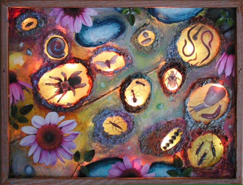
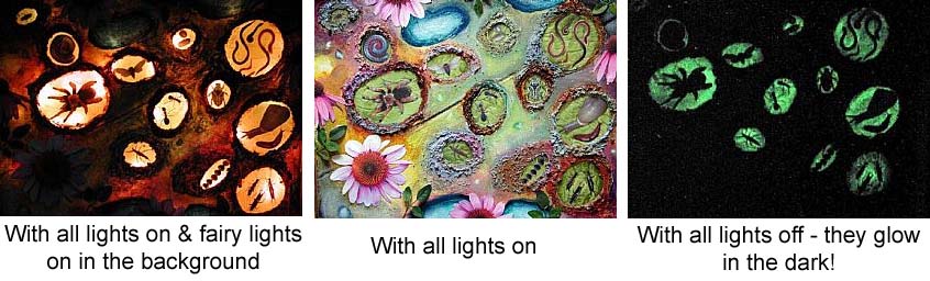
"THE GIRL WITH THE X-RAY EYES "
Shadow Box
Mixed Media on Glass with glow-in-the-dark-paint
14 x 18"
"When I was a child I made an insect cemetery. Over time it grew and it also became the final resting place for the occasional frog or bird. Sometime during those years I sent away for a pair of x-ray glasses after seeing an ad in a comic book. I couldn't wait to see through walls and into places the eyes can't penetrate, and of course I knew I would also be able to see through people's clothes. Much to my dismay, the glasses didn't work, but perhaps this is what I would have seen had they been real.
This mixed-media piece was done using a frame that I turned into a light box. I simply turned it upside down and placed the glass at the back instead of the front. I put fairy lights behind it for the glowing affect. Tissue paper is attached to the front and wrapped around the sides of the glass using Golden Soft Gel Medium. Circles were cut out of the paper so the bugs could be seen through the glass. The bugs are photo images that are glued down to tissue paper, then attached to the back of the glass - they are underneath the earth and are viewed through the glass. I used a highly textured pumice medium to give the paint a more earthy look and spread it around the "burrows" so they would resemble nests. I used Golden acrylics and photo images of coneflowers, as well as silk leaves along the borders. The glass in this piece represents a window where one can peek into places unknown.
The most fun part of all is the glow-in-the-dark paint that I spread on the underside of each burrow. In darkness they glow a lovely phosphorescent green!
By Shawn Marie Hardy
http://www.honorwithart.com
http://shawnmariehardy.ebsqart.com
http://www.myspace.com/shawnmariehardy
A little about Shawn:
age: 45
Something people don't know about me: I struggle with agoraphobia and OCD
I am a mixed-media artist, currently living in Lansing, Michigan.
I create images that are emotive and tantalizing - impressions representing the core of my imagination, from transient thoughts and deep-rooted memories to endured tribulations. I am fascinated by dreams and the haunting images the mind conjures up while we're asleep. Most of my work is as spontaneous as these unconsious images and I tend to work directly on the canvas, rather than drawing a preliminary study or mixing paints separately on a palette.
I am also interested in spiritualism - not necessarily in the sense that the living communicate with the dead, but more in the sense that I question where our energy goes after we die. In the wonderment of these questions I create dreamy landscapes that represent the state of passing from present life into the next state of being. They are both light and dark, depicting both joy and melancholy, often with the focal point being a window of light or an ethereal, winged being on a path into the unknown. I sometimes incorporate copies of vintage photos into these landscapes - visages of unknown people who have passed on, in order to give them a purpose and to honor those lives that are long forgotten.
Besides my online gallery, I am not currently exhibiting. Most of my time lately is spent working on a project that will benefit missing and exploited children (see the honorwithart site). I'm gathering art from artists all over the world and using that work to create an "altered book." Once finished, the piece will be auctioned off with all proceeds going to charities that advocate for the cause.
posted by Nicole Wintermyer @ 9:32 PM
1 comments
![]()
![]()

posted by Nicole Wintermyer @ 1:12 PM
0 comments
![]()
![]()
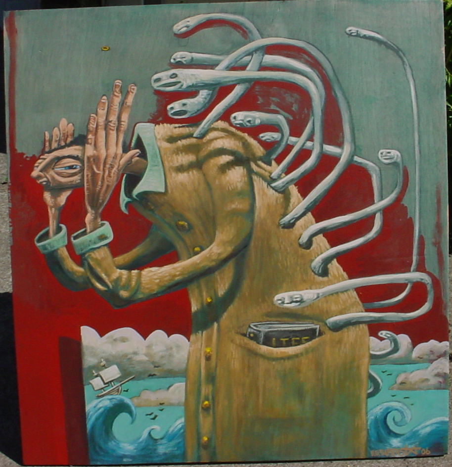
"Divorce"
25" x 28"
Acrylic on Wood
"This is a painting about Divorce. My wife and I just split up and it was pretty frigg'n sad. I did a drawing for this painting about 4 days after we had decided to break up. Almost everything in the painting stands for something.
Hands over ears= denial.
Worms in back talking to person= past and present/reflecting on life
Book of life in pocket= what will be the next chapter, read on.
Red= blood. good and bad.
Ring coming off of the finger= being single
Waves in the back ground= The sea of life and how we might not beprepared for what it turns into.
By Brett Superstar
www.homepage.mac.com/bwsuperstar/
posted by Nicole Wintermyer @ 1:50 PM
0 comments
![]()
![]()
 Project Truth Collection and Reflection
posted by Nicole Wintermyer @ 12:53 PM
0 comments
![]()
![]()
posted by Nicole Wintermyer @ 9:40 PM
0 comments
![]()
![]()
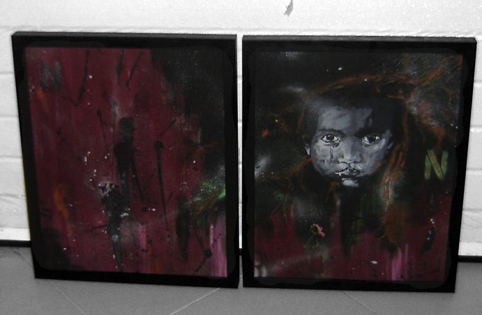
"N"
50 X 75 cm
mixed media on 2 framed canvas
"I was inspired to make this painting, right after watching "The Inconnvenient Truth", which made me become even more aware of our planet's situation. The global warming, and all the environmental disaters, are destroying a lot of cities and killing a lot of people, and all of this is Man's fault. That's what I represented, a crying african child, which tend to be the most harmed on most of the planet's problems inluding envorinemtal ones, since they are more vunerable, surrounded with some nature elements and textures [made on the canvas], using the right colours to represent this situation.
It's acrylic, ecoline, spray, pen, and sand paint.
By Pedro Ventura Matos. aka Drone
http://droneh.com.sapo.pt/
posted by Nicole Wintermyer @ 10:28 PM
0 comments
![]()
![]()
Just a quick note to say hello and happy new year! And thanks to everyone who has supported me on this project. I love what I'm doing and I hope you do as well. Cheers!
posted by Nicole Wintermyer @ 10:32 PM
1 comments
![]()
![]()
posted by Nicole Wintermyer @ 10:21 PM
0 comments
![]()
![]()
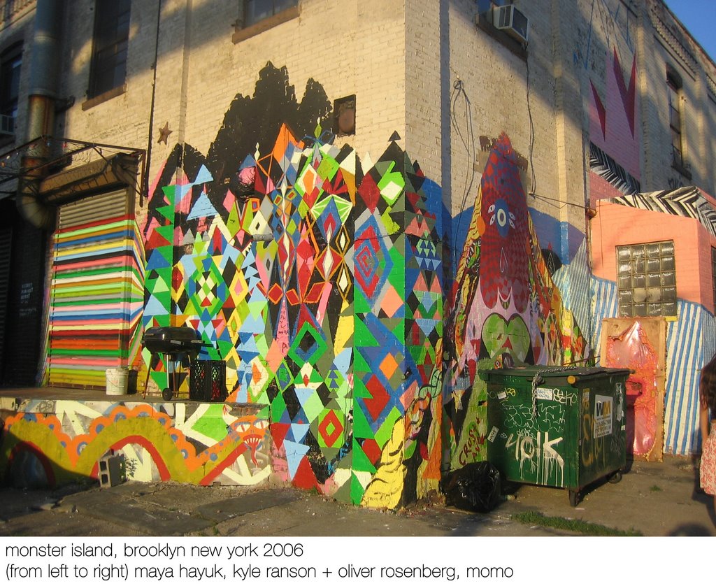 "Our Wall Could Be Your Life"
posted by Nicole Wintermyer @ 1:46 PM
0 comments
![]()
![]()

posted by Nicole Wintermyer @ 8:28 AM
0 comments
![]()
![]()
 "Geist"
posted by Nicole Wintermyer @ 12:31 PM
0 comments
![]()
![]()
posted by Nicole Wintermyer @ 9:50 PM
0 comments
![]()
![]()

posted by Nicole Wintermyer @ 5:57 PM
1 comments
![]()
![]()
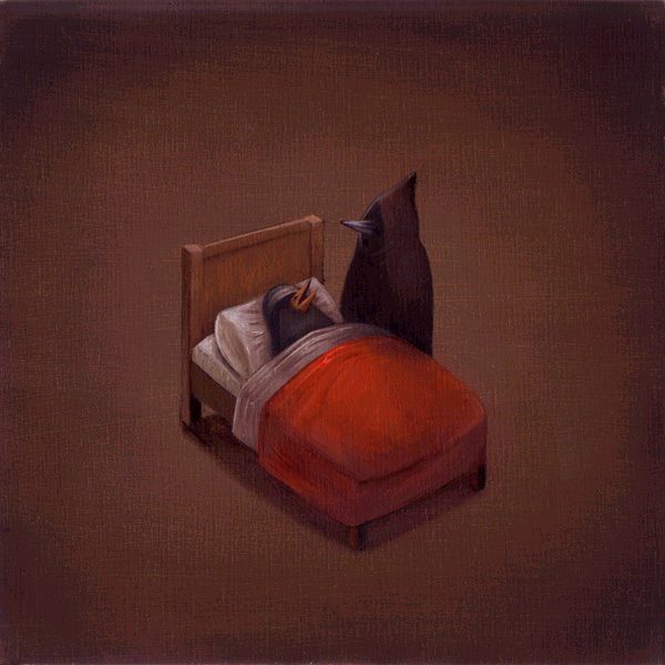 "Never Wake Up"
posted by Nicole Wintermyer @ 8:08 PM
1 comments
![]()
![]()
 "HeteRogamy"
posted by Nicole Wintermyer @ 9:16 AM
0 comments
![]()
![]()
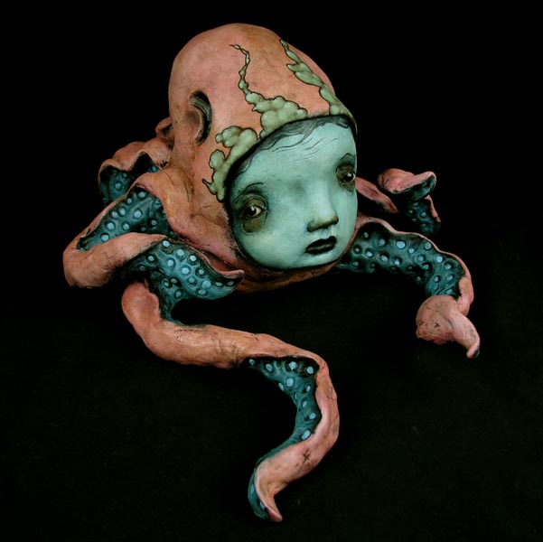 Octopus #3
posted by Nicole Wintermyer @ 10:23 PM
0 comments
![]()
![]()
arthead sf blog was created to bring readers the meaning behind the art. These are not critiques or interviews with artists. Each feature is written entirely by the artist, revealing only what they feel and want readers to know about the featured piece. If you see a piece of art you'd like to know the meaning behind...email me. And subscribe to my blog below to get updates when new features are posted!
i'm interested in ideas. and people who have them and make them realities